How to build a styling foundation with vanilla-extract
- Published On
- Read Time
- 8 min
- Updated On
- Mar 10, 2023
On This Page3 sections
The approach described in this article is inspired by the styling approach used in Braid Design System.
Vanilla-extract
About
vanilla-extract is a type-safe CSS-in-JS library that works at build time. All styles are generated and extracted when building the application, resulting in zero runtime overhead. It works similar to CSS Modules but with much better developer experience.
A warning upfront: Maintainers of the vanilla-extract library are not very active at the moment. While it’s still maintained, issues often don’t get any responses or are not solved for a long time. I still recommend it for side-projects but would be careful before using it in a business critical project. As runtime CSS-in-JS libraries are not recommended anymore, I hope that the library get more popular and is better maintained in the future.
Packages
Vanilla-extract is a collection of packages to support different use cases. The most common ones are:
@vanilla-extract/css: This is the core package that supports creating global styles (e.g. a CSS reset) and scoped styles for which the CSS class name is automatically generated. In addition, it supports creating themes for design tokens (colors, spacing, …) based on CSS custom properties.@vanilla-extract/sprinkles: The sprinkles package creates utility classes, like Tailwind does. Define commonly used CSS properties and values, optionally with conditions like breakpoints or dark mode, and vanilla-extract generates a separate class for each of them.@vanilla-extract/recipes: With the recipes package you can create multi-variant styles with a type-safe API. For example, styles for a button with different variants (solid, ghost, …) and sizes (small, medium, large).
We’ll see how these packages work in detail in the next chapter.
Implementation
Overview
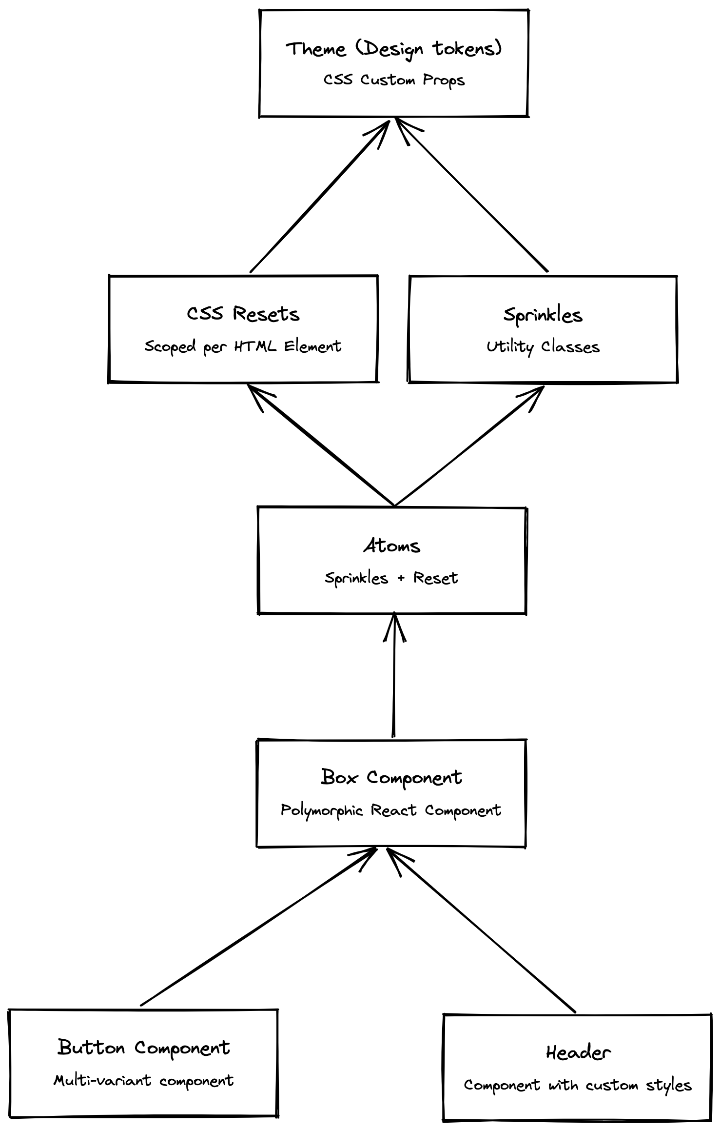
The following diagram shows how the styling is structured. Based on the theme, we create sprinkles (utility classes) and CSS resets, which then are combined into an atoms() function. We create a polymorphic box component that uses the atoms function. Based on the box component we create multi-variant components and other components with custom, scoped styling.
Theme
A theme is a collection of design tokens: colors, spacing, shadows and more. Vanilla-extract creates a CSS custom property for each token, that then can be referenced in styles. It’s possible to create multiple themes for light/dark mode, density, etc.
If you don’t have a color palette yet, I recommend using Radix Colors. It’s an open-source color system that provides accessible color palettes with both, light and dark mode.
First, we define the tokens as a nested object. The example is shortened, just to demonstrate the idea. How you exactly structure the object is up to you.
export const tokens = {
  color: {
    primary: {
      bg: "#e4f9ff",
      text: "#0078a1",
      // ...
    },
    neutral: {
      // ...
    },
  },

  // Spacing, font sizes, shadows, ...
  // ...
} as const;
Then we use the createGlobalTheme function to create a global theme. The function returns an object of the same structure as the tokens object, but it contains the created CSS custom properties as values:
import { createGlobalTheme } from "@vanilla-extract/css";
import { tokens } from "./tokens";

export const vars = createGlobalTheme(":root", tokens);
CSS Reset
It’s possible to create a global CSS reset using the globalStyle function:
import { globalStyle } from "@vanilla-extract/css";

globalStyle("body", {
  margin: 0,
  padding: 0,
});
Another approach is to create scoped CSS resets using the style function. There is a base reset and a separate reset for each HTML element like lists and links:
export const baseReset = style({
  margin: 0,
  padding: 0,
  border: 0,
  boxSizing: "border-box",
  // ...
});

const list = style({
  listStyle: "none",
});

const a = style({
  textDecoration: "none",
  color: "inherit",
});

type Resets = Partial<Record<keyof JSX.IntrinsicElements, string>;
export const elementResets: Resets = {
  ul: list,
  ol: list,
  a,
  // ...
};
The CSS reset file then must be imported in the entry file. This ensures that the order of the styles is correct. The reset styles should come first and will be overwritten by any other, more specific style.
import './reset.css'; // <-- Import the reset file

import React from "react";
import ReactDOM from "react-dom/client";
import { App } from "./app";

const root = ReactDOM.createRoot(...);
root.render(<App />);
The CSS reset is not yet used. We first need to create an atoms() function.
Atoms
There are some CSS properties that you will use repeatedly. Like margin/padding or some text/background colors. Instead of repeating them over and over again, producing a lot of duplicate CSS code, we create an atoms() function based on the sprinkles package. This not just provides better developer experience but also reduces the CSS output.
First, we define the common properties and values, split into three categories: unresponsive properties, color properties that depend on the theme (light, dark) and responsive properties that depend on breakpoints.
import { vars } from "./theme";

export const unresponsiveProps = {
  minBlockSize: ["100vh"],
  userSelect: ["none"],
  cursor: ["default", "pointer"],
} as const;

export const colorProps = {
  background: {
    primary: vars.color.primary.bg,
    neutral: vars.color.neutral.bg,
  },
  color: {
    primary: vars.color.primary.text,
    neutral: vars.color.neutral.text,
  },
} as const;

export const responsiveProperties = {
  margin: vars.size,
  padding: vars.size,
  alignItems: ["start", "center", "end"],
  // ...
} as const;In contrast to Tailwind, which generates the classes on-the-fly, vanilla-extract will generate the styles for all defined properties/values, regardless of whether they are used or not. Defining too many properties/values will bloat your CSS. Only define the properties that you actually need a lot.
Next, we use these properties to create sprinkles:
import { ... } from "@vanilla-extract/sprinkles";
import { ... } from './props';

const unresponsiveAtomicProps = defineProperties({
  properties: unresponsiveProps,
});

const colorAtomicProps = defineProperties({
  properties: colorProps,
  defaultCondition: 'lightMode',
  conditions: {
    lightMode: {},
    darkMode: { '@media': '(prefers-color-scheme: dark)' }
  },
});

const responsiveAtomicProps = defineProperties({
  properties: responsiveProperties,
  conditions: {
    sm: {},
    md: { "@media": `screen and ...` },
    lg: { "@media": `screen and ...` },
  },
  defaultCondition: "sm",
  responsiveArray: ["sm", "md", "lg"],
});

export const sprinkles = createSprinkles(
  unresponsiveAtomicProps,
  colorAtomicProps,
  responsiveAtomicProps,
);
Finally, the atoms() function combines the sprinkles and the CSS resets. The function accepts any sprinkles properties, a list of class names and an HTML tag name to apply a CSS reset. The clsx package is used to combine class names.
import { baseReset, elementResets } from "./reset";
import { sprinkles, Sprinkles } from "./sprinkles.css";
import clsx from "clsx";

export interface Atoms extends Sprinkles {
  reset?: keyof JSX.IntrinsicElements;
  className?: string | string[];
}

export function atoms(atoms: Atoms) {
  const { reset, className, ...rest } = atoms;
  const sprinklesClassNames = sprinkles(rest);

  return clsx(sprinklesClassNames, className, reset ? [baseReset, elementResets[reset]] : null);
}
The atoms() function can now be used to create a box component.
Box Component
The box component is a polymorphic React component that renders a div by default. It can be customized to render any other element, accepts all properties of that element and every sprinkles property. And because it uses the atoms() function, it will apply the CSS reset for that HTML element.
This is how the Box component can be used:
// Renders a div, CSS reset will be applied
<Box>Content</Box>

// Use sprinkles
<Box userSelect="none">Text</Box>

// Use responsive props
<Box margin={[2,4,8]}>Content</Box>

// Render a list
<Box as="ul" className="my-list">
  <Box as="li">Item 1</Box>
</Box>
Here is the basic implementation. The component extracts all atom properties from the component props (propsToForward ). It then passes the atom properties to the atoms() function together with the reset property to apply reset styles.
export const Box = forwardRef((props, ref) {
  const { as: Component = "div", ...other } = props;
  const [atomsProps, propsToForward] = extractAtoms(other);
  const className = atoms({
    className: propsToForward.className,
    reset: typeof Component === "string" ? Component : "div",
    ...atomsProps,
  });

  return (
    <Component
      {...propsToForward}
      className={className}
      ref={ref}
    />
  );
});
The extractAtoms function splits the list of properties into atom properties and other props:
import { omit, pick } from "lodash";

const keys = Array.from(sprinkles.properties.keys());
export const extractAtoms = <P extends object>(props: P) => [pick(props, keys), omit(props, keys)];
Custom styles
The sprinkles only provide a limited set of CSS properties. For every other use case, use the style function to create scoped styles for components. Import the vars object from the theme file to access design tokens:
import { style } from "@vanilla-extract/css";
import { vars } from "./theme.css";

export const grid = style({
  display: "grid",
  gridTemplateColumns: "...",
  // ...
});

export const label = style({
  letterSpacing: vars.font.letterSpacings.label,
  // ...
});
Recipes
Components with multi-variant styles, like a button, can be created with the recipes package. We create the component based on the box component, which allows us to pass all atoms properties and will apply the CSS reset for the button element.
import * as css from "./button.css";

const Button = forwardRef((props, ref) => {
  const { tone, variant, className, ...rest } = props;
  const variantClass = css.button({ tone, variant });

  return (
    <Box
      as="button"
      ref={ref}
      display="inlineFlex"
      justifyContent="center"
      alignItems="center"
      className={clsx(variantClass, className)}
      {...rest}
    />
  );
});
The multi-variant styles are created using the recipe() function:
import { recipe } from "@vanilla-extract/recipes";

export const button = recipe({
  base: {
    /* styles */
  },

  variants: {
    tone: {
      primary: {
        /* styles */
      },
      neutral: {
        /* styles */
      },
      critical: {
        /* styles */
      },
    },
    variant: {
      soft: {
        /* styles */
      },
      ghost: {
        /* styles */
      },
      soft: {
        /* styles */
      },
      transparent: {
        /* styles */
      },
    },
  },
  defaultVariants: {
    tone: "primary",
    variant: "ghost",
  },
});
Sprinkles are also supported as part of the recipe. Provide an array to use both, sprinkles and custom styles:
export const button = recipe({
  variants: {
    color: {
      primary: [
        sprinkles({ background: "primary" }),
        {
          borderColor: vars.color.primary.border,
        },
      ],
    },
  },
});
Foundational Components
It’s highly recommended creating more foundational components that can be reused across the application, to reduce the amount of CSS you need to write (and ship to the client). A common example is the Stack component.
Summary
We’ve created a solid styling foundation using vanilla-extract. Based on the theme, the atoms() function and the polymorphic box component, we can now create more foundational components and multi-variant styles. Thanks to TypeScript we get a much better developer experience than with plain CSS.