Controlled Components in Storybook
- Published On
- Read Time
- 4 min
On This Page6 sections
We’ll use a simple <Input /> component that accepts a defaultValue property in uncontrolled mode and a value and onValueChange property in controlled mode.
We’ll use TypeScript, Storybook 7 and Component Story Format 3 (CSF3).
About Storybook
Storybook is a frontend workshop for building UI components and pages in isolation. It can be used to develop components in isolation, to run automated tests, as component documentation, design system and much more.
Args & Controls
Stories in Storybook accept Args, also known as Props in React / Vue (or Inputs / Outputs in Angular). Storybook provides the Controls Addon which render controls to change the property values manually at runtime in the Storybook UI. It supports multiple types, like text values, dates, colors, booleans and more.

Controlled vs Uncontrolled
An uncontrolled component handles its own state. In a controlled component, the state is managed from outside, i.e. provided by the parent component via props.
// Uncontrolled
<Input defaultValue="John Doe" />;

// Controlled
const [name, setName] = useState("John Doe");
<Input value={name} onValueChange={setName} />;
Uncontrolled Story
Uncontrolled components are easy to handle in Storybook. Provide the initial state via args and disable controls for controlled props.
const Uncontrolled: Story = {
  args: {
    defaultValue: "John Doe",
  },
  argTypes: {
    value: {
      control: { disable: true },
    },
  },
};
In the story above, we provide the defaultValue property and disable the control of the value prop, because the value prop would turn the component into a controlled component.
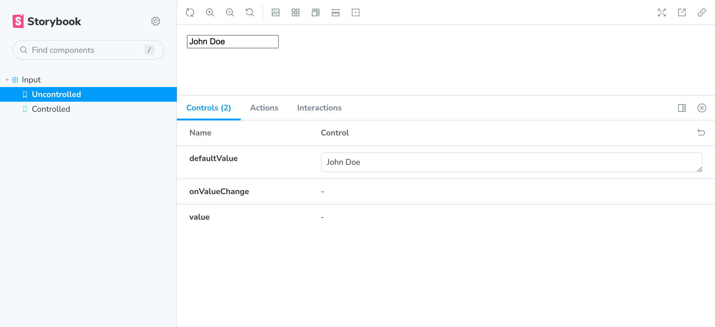
The <Input /> component uses the provided default value. The default value changed be changed via Storybook Controls (requires to reload the component as the default value will only be applied once) and the value can be edited inside the component.
Controlled Story
For controlled stories, we provide the value property via args:
const Controlled: Story = {
  args: {
    value: "John Doe",
  },
};
You can now control the value via Storybook Controls. There is one problem though. When you try to edit the value inside the component (and not via Storybook Controls), nothing happens - you can’t edit the value.
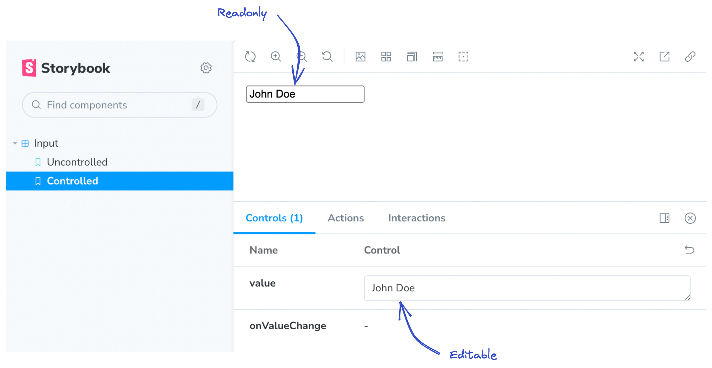
The component calls the onValueChange callback when the value changes. The callback is expected to update the value property, but this is not done by Storybook. Storybook will still provide the old value property. It’s the same behavior as rendering this in React:
<input value="This is readonly" />The value is hard-coded and never changes, resulting in a read only input.
For controlled components to work properly, we need to handle callbacks in Storybook.
Handling callbacks
We need to provide the onValueChange callback and update the value property. Fortunately, the @storybook/preview-api package provides a hook to do this:
import { useArgs } from "@storybook/preview-api";

const [args, setArgs] = useArgs();
setArgs({ value: "New Value" });
We add a custom render function to our Story and update the args in a custom onValueChange callback:
const Controlled: Story = {
  // ...
  render: function Component(args) {
    const [, setArgs] = useArgs();

    const onValueChange = (value: string) => {
      // Call the provided callback
      // This is used for the Actions tab
      args.onValueChange?.(value);

      // Update the arg in Storybook
      setArgs({ value });
    };

    // Forward all args and overwrite onValueChange
    return <Input {...args} onValueChange={onValueChange} />;
  },
};
We overwrite the onValueChange callback. In the callback we use setArgs to update the value in Storybook. We now have a controlled component.
But the approach can be improved a bit.
Instead of a custom render function, we can handle controlled values using decorators. This allows us to reuse the logic across multiple stories.
We add the decorator to the meta object. The decorator receives the <Story /> component as first argument and the context object, containing args and more, as second argument.
const meta = {
  // ...
  decorators: [
    function Component(Story, ctx) {
      const [, setArgs] = useArgs<typeof ctx.args>();

      const onValueChange = (value: string) => {
        ctx.args.onValueChange?.(value);

        // Check if the component is controlled
        if (ctx.args.value !== undefined) {
          setArgs({ value });
        }
      };

      return <Story args={{ ...ctx.args, onValueChange }} />;
    },
  ],
};
The decorator will be applied to all stories of the current file. For that reason, we must support both modes, controlled and uncontrolled. We do this by checking if ctx.args.value is undefined. In uncontrolled mode, we’ll receive undefined and don’t update the args in Storybook (which would turn the component into a controlled component). In controlled mode, we’ll receive a string value (which may be empty but never undefined) and update the value via setArgs(). We then render the Story component and forward the args with the custom onValueChange handler.
The render function on the Story can be removed.
That’s it, our story now renders a controlled input that can be updated via Storybook Controls and by editing the value inside the component.
Demo
Here is a simple demo of an uncontrolled and controlled input in Storybook.