The many ways to build a toast component in React
- Published On
- Read Time
- 12 min
On This Page6 sections
What are toasts?
Anatomy
A toast message typically includes a main container — often styled to reflect its severity — a title (such as “Action completed”), and may feature a close button or an action. Multiple toasts are grouped together within a region.

HTML Markup
There is no dedicated HTML element for toasts, and the ARIA Authoring Practices Guide (APG) does not define a specific toast pattern. To build an accessible toast message, you need to use existing ARIA roles and patterns.
A toast should use the alert role, which makes it a live region1 so screen readers announce its content automatically.
<div class="toast" role="alert">Action completed</div>Toast messages are usually rendered at the end of the page. To ensure keyboard and screen reader users can access them, wrap the toasts in an element with the region role and provide a clear label. There should also be a shortcut to focus on the region.
<div role="region" aria-label="Notifications">
  <div class="toast" role="alert">Action completed</div>
  <!-- more toasts -->
</div>
Now let’s look at how different libraries implement toast components.
Material UI
Features
MUI’s toast component is called Snackbar. It renders text and optional actions. It doesn’t support different styles directly but can be combined with MUI’s Alert component to achieve different visual styles. The position can also be customized.
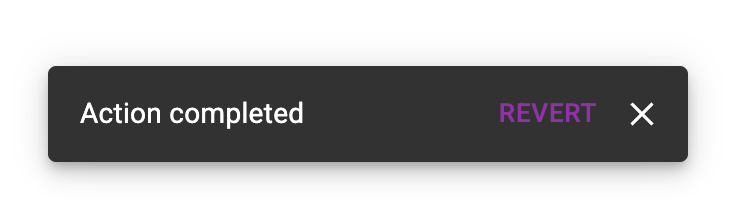
Toasts can be auto-dismissed and closed manually via the Escape key or a custom close button.
Implementation
MUI’s Snackbar is a single component with message and action props. You control its visibility with the open and onClose properties.
<Snackbar
  open={open}
  onClose={handleClose}
  message="Action completed"
  action={
    <Button color="secondary" size="small" onClick={onRevert}>
      Revert
    </Button>
  }
/>
The component renders a root element with the generic presentation role. The toast message uses the alert role, so its text is announced by screen readers. MUI adds a direction attribute, but this is not a valid HTML attribute. In the example below, screen readers will announce “Action completed Revert Close” because the actions are nested inside the alert element. Ideally, actions should be placed outside the alert to improve accessibility.
<div role="presentation">
  <div role="alert" direction="up">
    <div>Action completed</div>
    <div>
      <button type="button">Revert</button>
      <button type="button" aria-label="Close">x</button>
    </div>
  </div>
</div>
MUI renders toast elements inline at the component’s position using position: fixed, rather than portaling them to the end of the document. This approach works well for toasts triggered by direct user interaction, as users can easily tab to the toast and use its actions. However, if a toast appears in response to events elsewhere in the component tree - such as after an async request — keyboard users may have difficulty reaching the toast action.
To close a toast, the user can press the Escape key. MUI listens for keydown events on the document using a useEffect hook and calls the onClose callback when Escape is pressed.2
Toasts can also be automatically dismissed by setting the autoHideDuration property. If the user interacts with the toast — such as moving the cursor over it, focusing it with the keyboard, or if the page loses focus — the auto-dismiss timer is paused.3
PrimeReact
Features
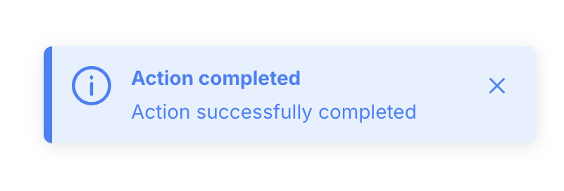
PrimeReact’s Toast component renders a title (called summary) and a message (called detail), supports multiple severity levels, and can be rendered in different positions.
It doesn’t support actions, but the toast’s content can be overwritten to render arbitrary content. The toast auto-dismisses after 3 seconds, but the lifetime can be configured, and sticky toasts are supported as well.
Implementation
PrimeReact uses a component for rendering the UI, but the actual toasts are triggered using an imperative API provided via a ref.
export default function App() {
  const toast = useRef(null);
  const show = () => {
    toast.current.show({
      severity: "info",
      summary: "Action completed",
      detail: "Action successfully completed",
    });
  };

  return (
    <>
      <Toast ref={toast} />
      <button onClick={show}>Show</button>
    </>
  );
}
Each toast is rendered as an element with the alert role. It also defines aria-live and aria-atomic, which are already implicitly set by the role.4
<div role="alert" aria-live="assertive" aria-atomic="true">
  <div>
    <div>
      <span>Action completed</span>
      <div>Action successfully completed</div>
    </div>
    <div>
      <button type="button" aria-label="Close">x</button>
    </div>
  </div>
</div>
The component handles the active toasts in local state and renders them inline at the component’s position, styled with position: fixed. While the component itself supports multiple toasts being shown at the same time, it doesn’t work well with multiple component instances. If the Toast component is rendered multiple times in the application and multiple instances show new toasts, they will overlap.
A toast starts the timer to automatically dismiss itself5 after 3s unless it’s defined as sticky. The timer stops if the user moves the cursor over the toast, but doesn’t handle keyboard focus or page focus, which makes it easier to miss notifications.
const [focused, setFocused] = useState(false);
const [clearTimer] = useTimeout(() => onClose(), 3000, !sticky && !focused);

const onMouseEnter = (event) => {
  if (!sticky) {
    clearTimer();
    setFocused(true);
  }
};

const onMouseLeave = (event) => {
  if (!sticky) {
    setFocused(false);
  }
};
Radix UI
Features
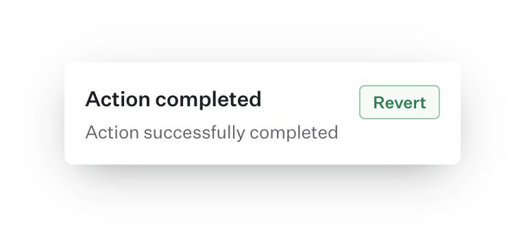
Radix UI’s Toast primitive renders a title, description, and an optional action and close button.
Toasts automatically disappear after a set time, but the timer pauses if you interact with the toast (using mouse or keyboard) or if the page loses focus. You can also close a toast manually using the close button, by swiping, or by pressing Escape when the toast is focused.
Radix UI includes accessibility features such as focusing the toast region with a hotkey, foreground and background sensitivity for announcements, and custom alt text for actions. This helps screen reader users understand how to trigger actions, especially for toasts that only appear briefly.
Implementation
Radix UI’s toast primitive is made up of several components. The Provider is used once at the root of the app to manage toast state. The Viewport component is where toasts are rendered, and it should be placed once near the end of your document.
<Toast.Provider>
  {/* app content */}
  <Toast.Viewport />
</Toast.Provider>
The Root component represents an individual toast and contains a title, description, and optional action. The toast’s visibility is controlled with the open prop.
<Toast.Root open={open} onOpenChange={setOpen}>
  <Toast.Title>Action completed</Toast.Title>
  <Toast.Description>Action successfully completed</Toast.Description>
  <Toast.Action altText="Open recent activities tab to revert changes">Revert</Toast.Action>
</Toast.Root>
The Toast.Root component renders the toast into the Viewport element using React Portal. The reference to the Viewport is provided via Toast.Provider. The provider also holds state with the number of active toasts, and each toast registers itself. This state is used by the viewport component to render certain elements only if there are any active toasts.

The toast itself has a status role, but there’s something odd - can you spot it?
<li role="status" aria-live="off" aria-atomic="true" tabindex="0">
  <div>Action completed</div>
  <div>Action successfully completed</div>
  <button
    type="button"
    data-radix-toast-announce-exclude
    data-radix-toast-announce-alt="Open recent activities tab to revert changes"
  >
    Revert
  </button>
</li>
The element uses the status role but disables notifications by adding aria-live="off", so nothing will be announced by screen readers. However, there’s another element with the status role rendered at the end of the document that is used for announcing the toast. For the toast message above, the content will look like this:
<span role="status" aria-live="assertive" aria-atomic="true">
  Notification Action Completed Action successfully completed Open recent
  activities tab to revert changes
</span>
Why two separate elements?
Toasts are often auto-dismissed, and if we announce the action with just its label, like “Revert,” we give screen reader users only a very short time to navigate to the toast via keyboard. By separating the announcement, we can replace the action label with more useful text explaining how to trigger the action.
The Viewport component renders an ol element, in which the toasts are rendered via React Portal.
<div role="region" aria-label="Notifications (F8)" tabindex="-1">
  <span aria-hidden="true" tabindex="0"></span>
  <ol tabindex="-1">
    <!-- Toasts (rendered via React Portal) -->
  </ol>
  <span aria-hidden="true" tabindex="0"></span>
</div>
The list is wrapped in an element with a region role, a landmark role that allows screen reader users to directly navigate to this section. For example, with VoiceOver you can press Control+Option+U to open the rotor and then navigate to landmarks with the left/right arrow keys.8
Radix also registers a keydown event handler for the configured hotkey and, when pressed, puts the focus on the ol element. Screen readers will announce the labelled region, the list element, and the number of toasts.
You may have noticed that there are two additional span elements, before and after the list. What’s their purpose?
As mentioned before, the toasts are rendered into the viewport element using React Portal. The createPortal() function from React DOM appends the element as the last child and there’s no way to change this; the list will start with the oldest toast and end with the newest toast. However, when tabbing through the toast list, you may want to go from the newest to the oldest toast message.

These elements act as a focus proxy,9 moving the focus to the first or last toast when entering the toast list, ignoring the actual DOM order of the toasts. Tabbing through the list of toasts is also intercepted to reverse the tab order.10
For auto-dismissal, each toast starts a timer. While interacting with a toast or when the window is not focused, all timers are paused. The Viewport component listens to these events and emits a CustomEvent to let the individual toasts know when a timer should be paused and resumed.11
React.useEffect(() => {
  const wrapper = wrapperRef.current;
  const viewport = ref.current;

  const handlePause = () => {
    const pauseEvent = new CustomEvent("toast.viewportPause");
    viewport.dispatchEvent(pauseEvent);
  };

  const handleResume = () => {
    const resumeEvent = new CustomEvent("toast.viewportResume");
    viewport.dispatchEvent(resumeEvent);
  };

  window.addEventListener("blur", handlePause);
  window.addEventListener("focus", handleResume);
  // ... (more events on the viewport omitted)

  return () => {
    window.removeEventListener("blur", handlePause);
    window.removeEventListener("focus", handleResume);
  };
});The viewport component is rendered in the root of the app and the individual toast components are rendered somewhere deep in the React component tree, so simply passing callbacks as props isn’t possible. Instead of using some React-specific solution like context, Radix simply uses the web platform for communication by relying on custom DOM events.
Instead of using CustomEvent, you can also subclass the Event class to create a custom event. Read Justin Fagnani’s Stop Using CustomEvent to learn more about it.
React Aria
Features
React Aria’s Toast Component (in alpha at the time of writing) renders a title, description, and a close button.
Toasts can be closed programmatically, via a close button, or auto-dismissed with an optional timeout property. Swiping is not supported.
Implementation
React Aria separates state management and rendering: they provide a set of components for the UI part and a ToastQueue class that manages the state of queued toasts. A new queue instance should be created once and shared across the app - either using a global variable or React context for scoped state management.
const queue = new ToastQueue();Then, there’s a set of components to render a toast region and the toasts in the root of your app, based on the queue. There are slots for the title, description, and close button, but any arbitrary content - including additional actions - can be rendered within the toast.
<ToastRegion queue={queue}>
  {({ toast }) => (
    <Toast toast={toast}>
      <ToastContent>
        <Text slot="title">{toast.content.title}</Text>
        <Text slot="description">{toast.content.description}</Text>
      </ToastContent>
      <Button slot="close">x</Button>
    </Toast>
  )}
</ToastRegion>
And finally, new toasts can be queued via ToastQueue instance:
<Button onPress={() => queue.add({ title: "...", description: "..." })}>Show Toast</Button>Similar to Radix UI, React Aria renders the toasts in a labelled region. The region can be focused with the F6 key, which is handled by its LandmarkManager.12
<div role="region" tabindex="-1" aria-label="1 Notifications.">
  <ol>
    <li>
      <div
        role="alertdialog"
        aria-modal="false"
        aria-labelledby="toast-title"
        aria-describedby="toast-description"
        tabindex="0"
      >
        <div role="alert" aria-atomic="true">
          <span id="toast-title">Title</span>
          <span id="toast-description">Description</span>
        </div>
        <button type="button" aria-label="Close">x</button>
      </div>
    </li>
  </ol>
</div>
The toast content has the alert role and wraps the title and description. The close button lives outside of it, and everything is wrapped within a non-modal alertdialog.
The ToastQueue acts as the central state manager for the toasts that holds the queue of toasts. It handles the visibility of the toasts and supports limiting the number of toasts shown at the same time. It also starts a timer for auto-dismissal of toasts. If the user interacts with a toast, the region pauses all timers via the ToastQueue instance.13
It also assigns a unique identifier to each toast:
const toastKey = "_" + Math.random().toString(36).slice(2);They’re prefixing the id with an underscore to make it a valid CSS identifier, so it can be used for things like view-transition-name.14
Conclusion
Implementing a toast component in React can be done in various ways, each with its own trade-offs. Doing it the right way and making it accessible for everyone is not easy, and it’s highly recommended to use a library because there’s so much to consider - and we didn’t even cover all the details (like focus management when a user dismisses a toast).
I definitely suggest React Aria; it provides by far the most accessible implementation and gives you full control over the UI.
I hope you enjoyed this article. Send me your feedback on Bluesky.
Footnotes
-
Learn more about the
alertrole on https://developer.mozilla.org/en-US/docs/Web/Accessibility/ARIA/Roles/alert_role#description ↩ -
MUI listens for
keydownevents to close toasts: https://github.com/mui/material-ui/blob/1a6757d80ce4427360c68743e96a6b6b8b7daa8b/packages/mui-material/src/Snackbar/useSnackbar.ts#L37-L59 ↩ -
MUI listens for several events to stop the auto-dismiss timer if the user interacts with the toast: https://github.com/mui/material-ui/blob/1a6757d80ce4427360c68743e96a6b6b8b7daa8b/packages/mui-material/src/Snackbar/useSnackbar.ts#L87-L140 ↩
-
Setting
role="alert"is equivalent to settingaria-live="assertive"andaria-atomic="true", see https://developer.mozilla.org/en-US/docs/Web/Accessibility/ARIA/Reference/Roles/alert_role ↩ -
PrimeReact uses a custom
useTimerhook to auto-dismiss toasts https://github.com/primefaces/primereact/blob/c72210495c7af5cfb92aed2a47afff86105dea58/components/lib/toast/ToastMessage.js#L25-L31 ↩ -
NVDA doesn’t announce the initial text of an element with role
statushttps://github.com/nvaccess/nvda/issues/14591 ↩ -
Radix delays the rendering of the announcement text using a custom
useNextFramehook: https://github.com/radix-ui/primitives/blob/79304015e13a31bc465545fa1d20e743a0bce3c5/packages/react/toast/src/toast.tsx#L686 ↩ -
Read more about VoiceOver and landmarks: https://support.apple.com/en-US/guide/voiceover/vo35709/mac ↩
-
The focus proxy moves the focus into the toast list when coming from outside: https://github.com/radix-ui/primitives/blob/13e76f08f7afdea623aebfd3c55a7e41ae8d8078/packages/react/toast/src/toast.tsx#L291-L299,309-317 ↩
-
Radix uses a keydown handler to reverse the tab order of toasts: https://github.com/radix-ui/primitives/blob/13e76f08f7afdea623aebfd3c55a7e41ae8d8078/packages/react/toast/src/toast.tsx#L237-L241 ↩
-
Radix pauses and resumes timers based on certain events: https://github.com/radix-ui/primitives/blob/13e76f08f7afdea623aebfd3c55a7e41ae8d8078/packages/react/toast/src/toast.tsx#L509-L529 ↩
-
React Aria’s LandmarkManager handles navigation between different landmarks on the page. The user can navigate through all registered landmarks forward (
F6) and backward (Shift + F6): https://github.com/adobe/react-spectrum/blob/a7b1a28e0ed7b999c6cb40d7d49136ecaf2b3aed/packages/%40react-aria/landmark/src/useLandmark.ts#L111 ↩ -
The Toast Region pauses the timers via toast queue https://github.com/adobe/react-spectrum/blob/b45f39a14ff36a45dcdc4d4556164b8e33ab92a3/packages/%40react-aria/toast/src/useToastRegion.ts#L49-L55 ↩
-
React Aria’s Toast Key is always a valid CSS identifier because of the
_prefix: https://github.com/adobe/react-spectrum/pull/7783#discussion_r1960725075 ↩