Building Component Slots in React
- Published On
- Read Time
- 10 min
- Updated On
- May 28, 2023
On This Page11 sections
About slots
Slots allow us to pass elements to a component and tell the component where these elements should be rendered. A component may support an implicit default slot (unnamed) and optionally, one or more named slots.
Here’s an example using the slots API of WebComponents:
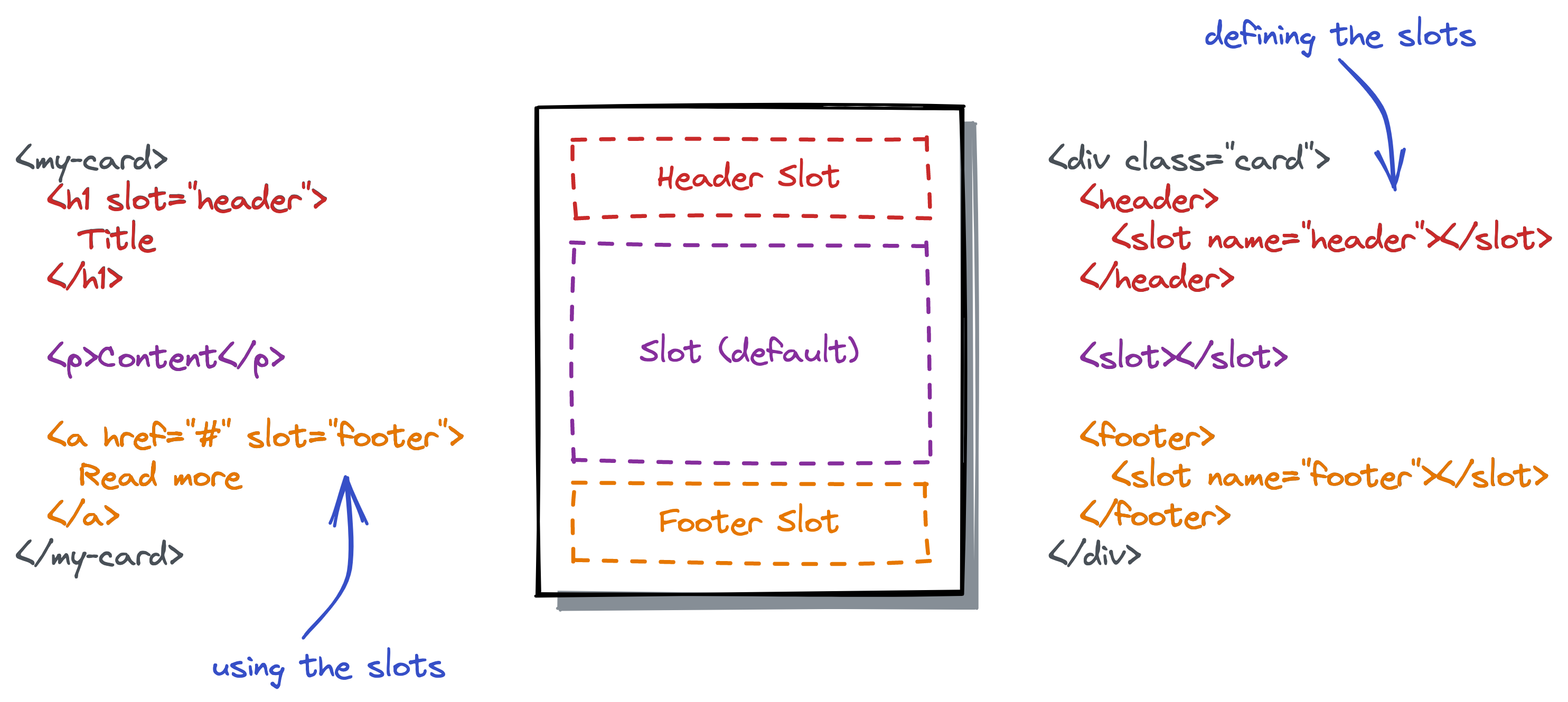
React doesn’t have an official concept of named slots but JSX is pretty flexible and allows us to implement named slots in different ways. Let’s take a look at different approaches.
Default slot (children)
The default slot in React is known as children property. Whatever you pass between the opening and closing tag of a component is passed as children property to that component and acts as the default slot.
<Card>
  {/* Default slot passed as `children` property */}
  <p>Content</p>
</Card>
Instead of accepting ReactNode as children you can define any other type when using TypeScript, limiting what a parent is allowed to pass. A FormattedDate component may only accept a date value:
<FormattedDate>{date}</FormattedDate>Multiple slot props
The children property itself is a normal property like any other property a component accepts. Instead of passing the elements between the tags you can pass the children property directly:
<Card children={<p>Content</p>} />For the most simple implementation of named slots, we can define additional props – similar to children – that work as named slots:
<Card header={<h1>title</h1>} content={<p>Content</p>} footer={<a href="#">Read more</a>} />This API is type-safe (when using TypeScript), easy to discover for consumers of the component and consumers don’t have to care about the order of elements/props.
The drawback of this approach is that you need to pass the named slots as properties. Passing it between the opening and closing tag is not possible (except for the default slot).
Compound components
For compound components we split our component into multiple components, like Card, CardHeader and CardFooter, where the latter two acts similar to named slots:
function CardHeader(props) {
  return <header>{props.children}</header>;
}

function CardFooter(props) {
  return <footer>{props.children}</footer>;
}

function Card(props) {
  return <div className="card">{props.children}</div>;
}
The three components then build together a card:
<Card>
  <CardHeader>
    <h1>Title</h1>
  </CardHeader>
  <p>Content</p>
  <CardFooter>
    <a href="#">Read more</a>
  </CardFooter>
</Card>
We can couple the three components more tightly together by attaching the two slot components to the Card component:
function CardHeader(props) { /* ...*/ }
function CardFooter(props) { /* ... */ }
function Card(props) { /* ... */ }

Card.Header = CardHeader;
Card.Footer = CardFooter;
Now we can use Card.Header and Card.Footer which makes it even more clear that they belong to the Card component:
<Card>
  <Card.Header>...</Card.Header>
  <p>Content</p>
  <Card.Footer>...</Card.Footer>
</Card>
The order in which these three components are used matters. If we move Card.Footer to the top it will be rendered before the header. The Card component could use CSS flex or grid to reorder them, but that’s not recommended for accessibility reasons. For a Card component the order is probably obvious, but there may be other use cases where it’s not.
Slots by type
We can create slots based on the type of elements that are passed as children. For this approach we need to understand how JSX is compiled.
JSX is just a syntax extension for JavaScript and is compiled down to React.createElement() calls (or jsx()). When we create an element like <Card>Content</Card>, we actually get an object that looks like this (simplified):
{
  type: function Card(props) { /*...*/ },
  props: {
    children: "Content"
  }
}
The object contains the component (our Card function) and all props we pass to that component, including all children. Inspecting the type property we know what component (or HTML element) it is.
With that knowledge we can create slots based on the type. We first create two components for the header and footer that just return the children without rendering anything on their own:
function CardHeader(props) {
  return <>{props.children}</>;
}

function CardFooter(props) {
  return <>{props.children}</>;
}
Then our Card component loops through all children and checks if it’s a CardHeader, CardFooter or something else. It then wraps the header and footer in a header respectively footer element and renders any other content in-between those two elements.
function Card(props) {
  let header;
  let footer;
  let content = [];

  React.Children.forEach(props.children, (child) => {
    if (!React.isValidElement(child)) return;
    if (child.type === CardHeader) {
      header = child;
    } else if (child.type === CardFooter) {
      footer = child;
    } else {
      content.push(child);
    }
  });

  return (
    <div>
      {!!header && <header>{header}</header>}
      {content}
      {!!footer && <footer>{footer}</footer>}
    </div>
  );
}The code above is just to demonstrate the approach and is not a production-ready implementation.
The Card component can then be used this way:
<Card>
  <CardHeader>
    <h1>Title</h1>
  </CardHeader>
  <p>Content</p>
  <CardFooter>
    <a href="#">Read more</a>
  </CardFooter>
</Card>
The approach can be combined with compound components. Instead of just returning the children, the CardHeader and CardFooter could render the <header> / <footer> element directly.
The order in which the components are used doesn’t matter anymore. The Card component reorders them anyway and also is in control of which elements are actually rendered. In addition, it could read the props of the child components or manipulate them to pass additional props.
It’s a powerful pattern that gives the component developer a lot of flexibility. We can extract the boilerplate code into a type-safe createSlots() function that creates slots based on the component or HTML element and also supports multiple elements of the same component. Such an API could look like this:
const Card = (props) => {
  const { children } = props;

  const slots = createSlots(children, {
    // Slot for the CardHeader component
    header: CardHeader,

    // Slot based on the HTML tag
    description: 'p',

    // Zero, one or more CardAction components
    actions: [CardAction],

    // Any other element that doesn't fit into
    // any slot above
    additionalContent: null,
  });

  return (
    <div className="card">
      {slot.header}
      <div className="card-description">
        {slot.description}
      </dv>
      <Collapsible>
        {slot.additionalContent}
      </Collapsible>
      <div className="card-actions">
        {slot.actions}
      </div>
    </div>
   );
};
Generic slot component
We can adapt the slot element of WebComponents in React by creating a generic, reusable Slot component that accepts a name property:
<Card>
  <Slot name="header">
    <h1>Title</h1>
  </Slot>
  <p>Content</p>
  <Slot name="footer">
    <a href="#">Read more</a>
  </Slot>
</Card>
The Card component then loops over their children, checking for any Slot element and reading their name property.
This reduces the number of components but also worsens the developer experience because the name property is not type-safe. As a consumer of the Card component we don’t know what slots exist without checking the implementation (or documentation that you surely write).
I don’t think it’s worth to use this approach over the previous one.
Slots with Context API
The two previous approaches have one limitation: they expect the slots to be used as a direct child. Wrapping a slot in a custom component is not possible:
<Card>
  <SomeComponent>
    {/* doesn't work, will be rendered in content */}
    <Card.Header>
      <h1>Title</h1>
    </Card.Header>
  </SomeComponent>
</Card>
Primer React, the React implementation of GitHub’s Primer Design System, uses slots based on the React Context API which solves this problem. A Slots component provides a register() and deregister() function via Context API to all slots, which they use to register/deregister themselves. This works independently of whether a slot is rendered as a direct child or somewhere nested in the JSX tree.
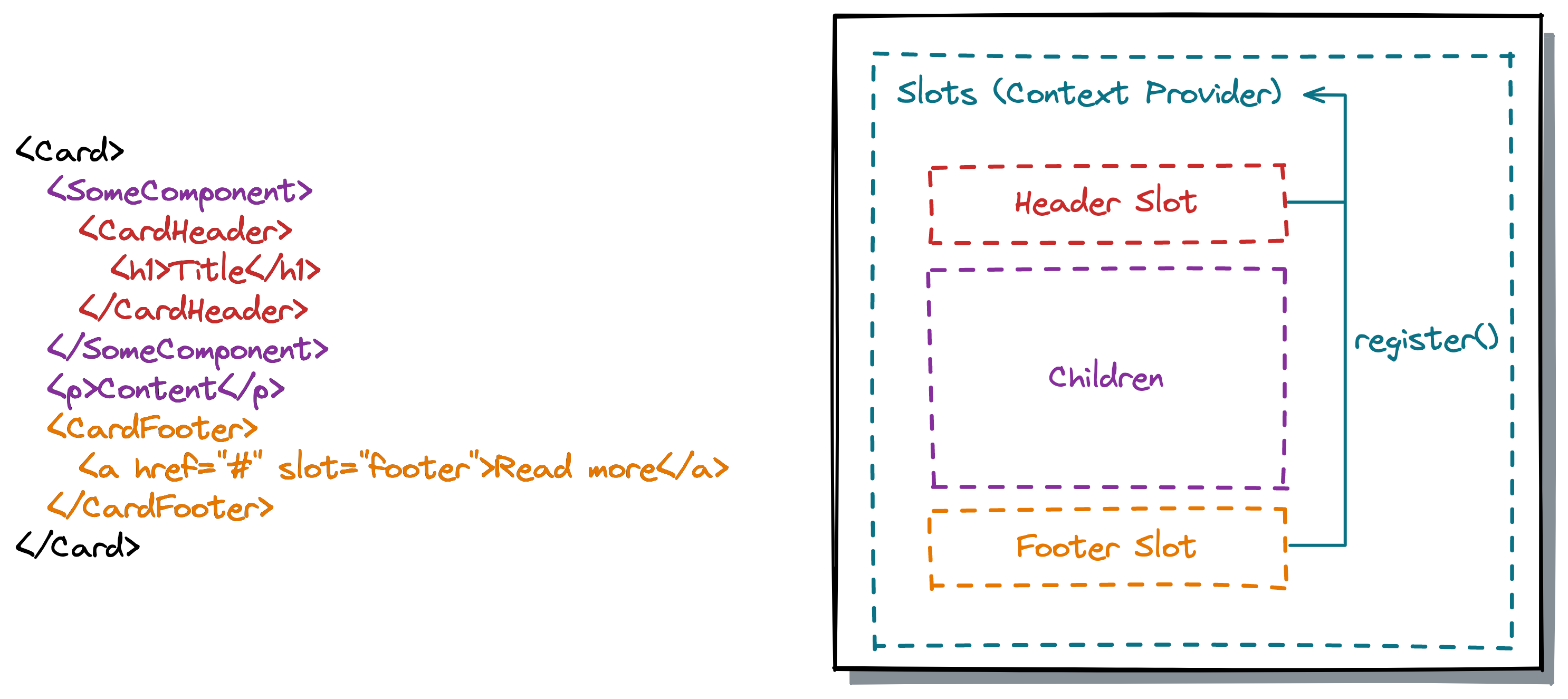
The createSlots() function creates the root Slots component and a Slot component that has a type-safe name property, based on the provided list of slot names when calling the function. The component then uses the Slots component to get access to all rendered slot elements. Each slot component registers itself via Context API (provided by the Slots component) in a useLayoutEffect() hook.
While this API provides a flexible and type-safe API it doesn’t play well with server-side rendering (SSR) because the named slots are only rendered on the client.
Fake DOM
Another approach is coming from React Aria. React Aria is a low-level, hook-based library to build UI components, maintained by Adobe. React Aria Components is a new headless component library, currently in alpha, that is built on top of React Aria. In the React Aria Components RFC they describe an interesting approach for allowing components to be wrapped (specifically for working with collections):
Rather than walking the JSX tree to collect items, […] rely on React itself to build and efficiently update collections. It works by implementing a tiny version of the DOM with just the methods React needs (e.g. createElement, appendChild, etc.). Then, it uses a React portal to render the collection into this fake DOM. React takes care of rendering all intermediary wrapper components […]. This gives us access to the underlying items as if they were rendered directly to the DOM, but without needing to pay this cost for large collections. We use this information to construct a Collection […]. It requires two renders whenever something in the collection changes. The first causes the portal to be rendered, which updates the fake DOM. It then needs to kick off a second render pass to render the items into the real DOM. However, because the first pass is rendering into a fake DOM, it is quite fast […].
The library first renders the list of items into a fake DOM to gather information about all <Item /> components - which may be deeply nested into some wrapper components. With that information they trigger the second render cycle to the actual DOM. I assume that this approach is also compatible with server-side rendering.
React Slots RFC
There is a React Slots RFC (Request for Comments) that would bring a slot API to React, eliminating the drawbacks of existing solutions. If or when this will be implemented is not clear yet.
Slots in other frameworks
Now after discovering different approaches in React, let’s take a look at how other frameworks solve this problem.
Vue
Vue supports the <slot> element for both the default slot and named slots. Starting with Vue 3.3, there is a new defineSlots() function that allows component authors to define the slots of a component and their props in the <script setup> block. Using the <slot /> element in the template is then fully type-safe.
<script setup lang="ts">
  defineSlots<{
    header(props: { title: string }): any;
    default(props: Record<never, never>): any;
  }>();
</script>

<template>
  <div class="example">
    <header>
      <slot name="header" title="Example" />
    </header>
    <slot></slot>
  </div>
</template>
Users of the component can then use the v-slot directive to render elements in a specific slot:
<Example>
  <template v-slot:header="headerProps">
    <h1>{{ headerProps.title }}</h1>
  </template>
  <p>Content</p>
</Example>
When using the slots you get type-safety for props (here headerProps) but the slot names are not fully type-safe, i.e. it’s possible to use a slot name that is not defined in the component, like <template v-slot:foo />.
Angular
Angular supports content projection with their ng-content element and the select attribute:
<div class="card">
  <header>
    <ng-content select="[cardHeader]"></ng-content>
  </header>
  <div>
    <ng-content></ng-content>
  </div>
  <footer>
    <ng-content select="[cardFooter]"></ng-content>
  </footer>
</div>
This example has a default slot and two “named” slots that accept all elements with the cardHeader / cardFooter attribute. We now can render elements into these slots by adding one of the two attributes:
<app-card>
  <h1 cardHeader>Title</h1>
  <p>Content</p>
  <a href="#" cardFooter>Read more</a>
</app-card>
The select attribute accepts other CSS selectors like:
- Element selectors:
my-element - Class selectors:
.btn - ID selectors:
#header - Pseudo classes:
.btn:not(.btn-secondary) - Combinations:
.btn,#btn
If you want to put an element into a specific slot that doesn’t match the selector, you can use ngProjectAs:
<!--
  Button is projected into <ng-content select=".btn">
  even if it doesn't have the `btn` class
-->
<button ngProjectAs=".btn" class="custom-button">
  Click Me
</button>
How does this API compare to the approaches in React? The selector approach is very powerful and lets us control where to render elements. However, there are some drawbacks or limitations:
- It’s static. The
selectattribute cannot be bound to a dynamic value, it must be a static string. Likewise, matching the selector to elements is static, toggling a class on an element doesn’t change if it’s projected or not. - Rendered at least once: All projected content is rendered at least once, and then either actually added to the document (if it gets selected by the component) or thrown away if it’s not matched by any
ng-contentelement. It’s better to use templates for conditional content projection. - Not type-safe (by default): The API is not type-safe. As a component consumer you don’t know what selectors exist. Component developers can create and export empty components or directives that match the used selectors to provide some hints to the consumers of their components.
- No nested content: Selectors cannot select nested elements. They only match direct children.
Summary
We saw different approaches of component slots in React. Now, which of them should you use? All of them have pros and cons, and it depends on your use case. I hope that the RFC will be accepted and implemented in React, which will give us a better API than today’s approaches.