Build better responsive components in Angular with Component Variants
- Published On
- Read Time
- 5 min
On This Page4 sections
How do you make your components responsive? Probably with a bunch of media queries in the component stylesheet. That works pretty well in many cases, but you lose some flexibility. What if you want to enforce the mobile layout in some locations like in a sidebar?
Let’s create responsive component variants instead. Variants inverse the responsibility and make the component more flexible.
And here is what we are going you build:
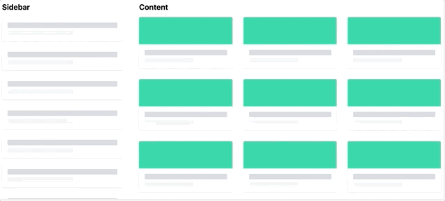
The same component uses a static layout in the sidebar but a dynamic layout that responds to the window width in the main content.
The Problem
Let’s take a simple component that renders some elements either as list items or as cards. The layout switch is implemented with CSS Media Queries.
.items {
  display: flex;
  flex-direction: column;

  @media (min-width: 600px) {
    flex-direction: row;
    flex-wrap: wrap;
  }
}

.item__header {
  @media (min-width: 600px) {
    // ...
  }
}
CSS Media queries are based on the window width (or height) and your component adjusts its layout based on that. If the component is used in multiple locations, like in the main content and in a sidebar, it will always have the same layout and you cannot control it.
Upcoming container queries will solve this problem (or at least some part of it) but they are not ready for production yet.
Until then, let’s remove those media queries and use responsive component variants instead.
The Solution
Here is the comparison of the previous approach and our new approach that we are going to implement:
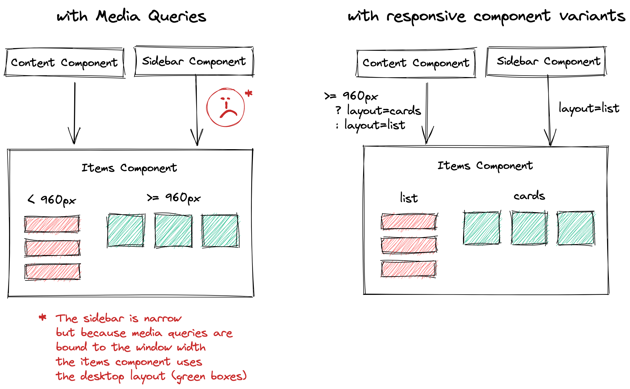
The media query based approach is not flexible enough. With responsive component variants
the parent component decides how the elements get rendered. This can be hard-coded like in the sidebar, which always uses the list layout, or dependent on the browser width as in the content component.
OK, let’s implement it.
Adding a variant
We extend our items component with a new layout input parameter.
export type Layout = "list" | "cards";

@Component()
class ItemsComponent {
  @Input()
  layout: Layout = "list";
}
We can then use that property to add a new CSS class and style the elements based on that class.
<div class="items" [ngClass]="{ 'items--as-cards': layout === 'cards' }">
  <!-- ... -->
</div>
This approach has a few advantages:
- The parent component can decide what layout to use.
A sidebar component may always want to use the
listlayout. - Testing the responsive behavior of the component is easier, you can use different input values.
- You can render elements depending the layout using
*ngIf. This may improve performance in some cases.
What if the parent component wants to change the layout depending on the browser width? Let’s make it responsive.
Making it responsive
The parent component can use matchMedia to get the matching breakpoint and change the layout.
const breakpoint = window.matchMedia("(min-width: 600px)");

// Get current value
console.log(breakpoint.matches);

// Listen for changes
breakpoint.addEventListener("change", (event) => {
  console.log(event.matches);
});
We first create a simple service to make this code reusable. For demo purposes we define the breakpoints directly in the service. In a real application you may want to use CSS Custom Properties to share the breakpoint values between CSS and TypeScript.
export type Breakpoint = "mobile" | "tablet" | "desktop";

@Injectable()
export class BreakpointService {
  readonly breakpoints: Record<Breakpoint, number> = {
    mobile: 0,
    tablet: 600,
    desktop: 960,
  };
}
Now let’s create a function to get the current breakpoint.
function getMatchingBreakpoint() {
  // Create a media query string for each breakpoint
  const bpNames = Object.keys(this.breakpoints) as Breakpoint[];
  const bpValues = Object.values(this.breakpoints);
  const queries = bpValues.map((bp) => `(min-width: ${bp}px)`);

  // Create an observable for each media query
  const matches$ = queries.map((query) => {
    const matchMedia = window.matchMedia(query);
    return fromEvent<MediaQueryListEvent>(matchMedia, "change").pipe(
      map((event) => event.matches),
      startWith(matchMedia.matches)
    );
  });

  // Get the last matching breakpoint
  // and return the breakpoint name
  return combineLatest(matches$).pipe(
    map((matches) => {
      return bpNames[matches.lastIndexOf(true)];
    })
  );
}
OK, what is going on here:
- We first create a media query for each breakpoint using
min-width. - For each query we then use the
fromEventfunction of RxJs to listen forchangeevents. This function will calladdEventListener('change', ...)for us. - The
changeevent will only emit if the value changes. To get the initial value, if the breakpoint currently matches or not, we use thestartWithoperator. - We then use
combineLatestto get the results of all breakpoints. We find the largest breakpoint that matches and return the name of that breakpoint.
This gives us the breakpoint, but we want to map that to components layout, either list or cards. For this we create another function that provides a type-safe breakpoint-to-value mapping:
function getResponsiveValue<T>(values: Record<Breakpoint, T>) {
  return this.getMatchingBreakpoint()
    .pipe(map((breakpoint) => values[breakpoint]));
}
The function expects a value of type T for each breakpoint. It listens for the matching breakpoint (using our previously defined function) and returns the value for that breakpoint.
Then we use that service in the component:
export class ContentComponent {
  layout$ = this.breakpointService.getResponsiveValue<Layout>({
    mobile: "list",
    tablet: "list",
    desktop: "cards",
  });
}
And the layout$ property in the template together with the async pipe:
<app-items [layout]="layout$ | async"></app-items>That’s it 🎉 We now have a flexible component that can be used in
the sidebar with the list layout and the responsive layout in our main content.
Demo
Here is the demo on StackBlitz:
stackblitz.com/edit/ng-component-variants
Wrap Up
We changed our component from using static media queries to responsive variants. Our component can now be used in different locations and the parent decides how to render the elements.
The breakpoint service makes it easy to get a value depending on the current browser width. If you use Angular Material in your application you can use the CDK Breakpoint Observer instead of this custom implementation.